A product leaderProduct LeaderDefines product vision, aligns teams and stakeholders, and turns business goals into products that create measurable user and business value. / product builderProduct BuilderTurns ideas into real, usable products by combining strategy, UX, technology, experimentation, and execution from concept to launch. using AI-native thinking to turn complex customer problems into clear, scalable digital products.
00:00:00
Warsaw
OrtoOptymist
Client
OrtoOptymist
Scope
Research, prototype, Webflow build
Year
March to December 2023
Role
Product Builder
In short
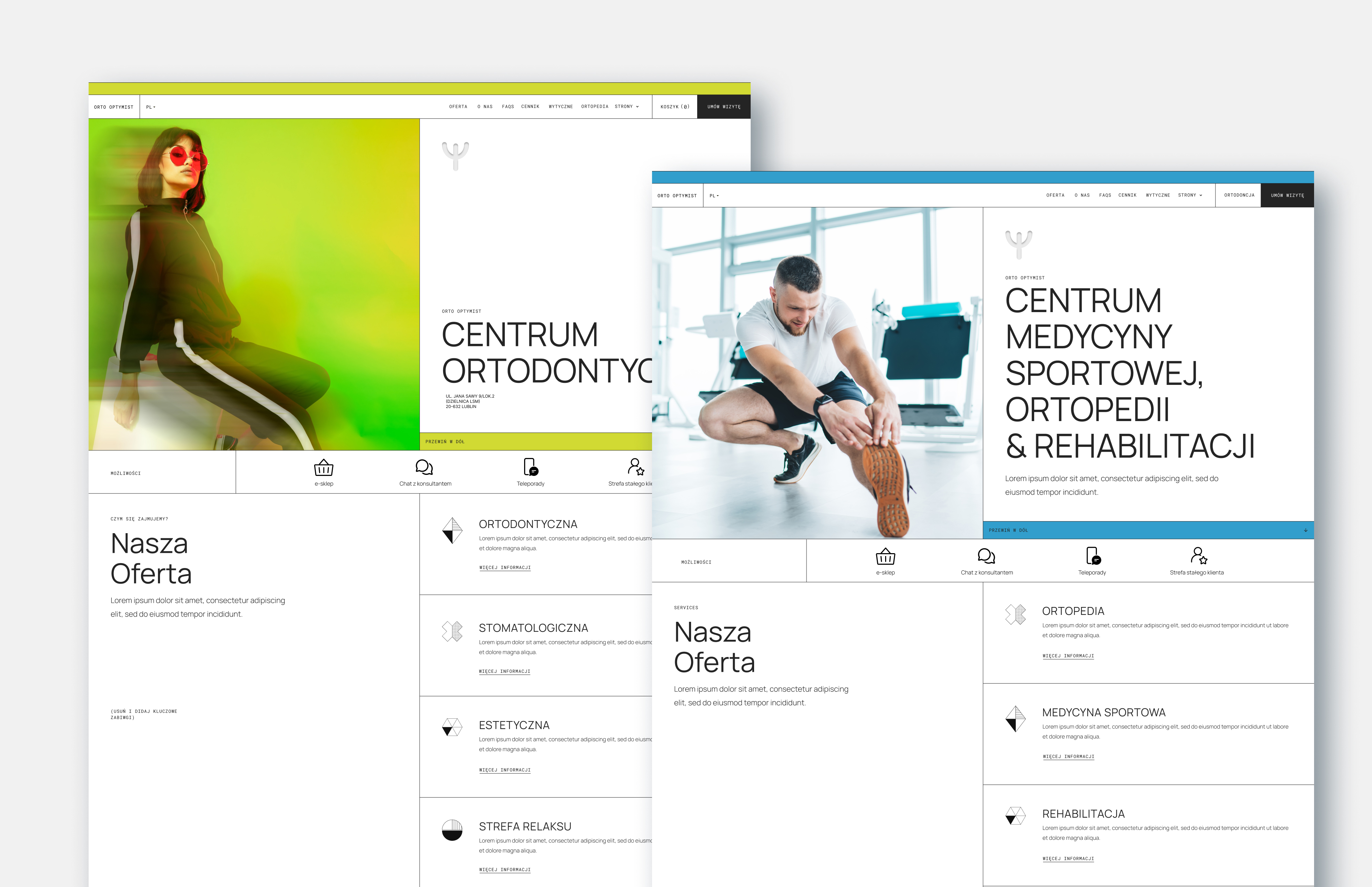
A private orthodontics and orthopedics practice that was always fully booked, entirely by word of mouth, with a website nobody visited before calling. OrtoOptymist wanted a younger audience, a sharper brand and a site that could do some of the selling. I led the research, the brand adjustments, the prototype and a Webflow build, inside one budget and one very firm rule.
Every brief has two lists. Here are both.
- A site built around patients' needs, with a captivating and purposeful journey
- To stand out from every other clinic in the city and stay future-proof
- Marketable, unique, inviting: something they could actually promote
- Appeal to teenagers and young adults without losing their parents
- Showcase the doctors' expertise and make reception's day easier
- No public online booking through a calendar. Appointments by phone or email only, full stop
- No new brand. Subtle adjustments to the identity they already had
- No budget growth, even when the wishlist grew. That constraint shaped the build
By the numbers
The problem
OrtoOptymist had a very good problem: a full appointment book. But every one of those bookings came from a recommendation, and not a single interviewee had looked at the website before calling. The site wasn't losing patients. It just wasn't earning any, and with a rebrand aimed at teenagers and young adults, it needed to start.
Direct and indirect competitors, judged on first impressions, interaction, visual design and content. The audit was uncomfortable in a useful way.
- A more professional, more responsive visual presentation
- A clearly defined brand identity, consistent from page to page
- A marketable, well-defined user flow that leads somewhere
Five people
The research sorted everyone around the clinic into five groups, and each group became a person with a problem statement. Meet them.
Try it yourself
The old site listed everything the clinic does in one long column, teeth and knees together. Untangle it: drag each service into its specialty, or tap a service and then a column.
The process
Four phases over ten months, with one pivot in the middle that made the budget work. Step through them.
Rather than treating every research finding as equally important, I consolidated and prioritized problems by user impact, business value and frequency.
Key pain points- Users struggled to find pricing and procedure information.
- Orthodontic and orthopedic content was difficult to distinguish.
- Excessive text increased cognitive load.
- The website did not effectively communicate the clinic's expertise.
- The digital experience was not sufficiently differentiated from competitors.
- Simplify navigation. Help users quickly understand where they are and where to go next.
- Create a purposeful customer journey. Move from an information-heavy website to an experience that supports discovery, trust and action.
- Reposition the digital brand. A contemporary visual language that better reflects the clinic and resonates with its audience.
Research showed users on both desktop and mobile, so a responsive strategy was set from the start rather than treating mobile as a secondary experience. I translated the findings into a new information architecture organised around user intent, separating services and content into clearer journeys. The goal was to reduce cognitive load while keeping the most important information immediately accessible.
Low-fidelity wireframes let me explore several approaches to navigation, content hierarchy and the key user journeys before anything was polished.
What wireframing let us do- Explore alternative information architectures
- Prioritize high-value content
- Identify unnecessary interactions
- Validate the placement of key functionality
- Align stakeholders before investing in high-fidelity design
The concepts were then translated into high-fidelity prototypes and iterated through stakeholder feedback and usability considerations.
The owners explicitly did not want public online calendar booking; appointments would continue by phone or email. Rather than forcing a conventional booking model onto the product, I designed the experience around the existing operational model and made the contact pathways clearer and easier to reach.
Given the scope, timeline and budget, I evaluated the options and selected Webflow. Starting from an existing Webflow foundation and adapting it substantially to the content architecture, visual identity and functionality defined in discovery let the team deliver a polished experience while keeping effort in line with the resources available.
Accessibility ran through the whole design process: readability, contrast, responsive behaviour and content hierarchy. The site follows WCAG 2.1 principles, adds text enlargement and contrast controls, and was tested across desktop and mobile breakpoints at magnification up to 200%. The content structure is built to grow without the architecture being rebuilt.
The project turned an information-heavy website into an intentional product experience built around user needs and business objectives.
- Clearer information architecture
- More intuitive navigation
- Stronger separation between service categories
- Improved access to high-intent information
- A more distinctive, contemporary brand experience
- Better alignment between user expectations and business goals
- Responsive experience across devices
- Accessibility built into the product
- A scalable foundation for future digital growth
Most importantly, the project showed that the core challenge was never visual design alone. Combining user research, product strategy, business constraints, prioritization, UX and implementation is what let the website become a real part of the customer journey and a stronger business asset.
Accessible by design
Teenagers on phones and parents on laptops, plus WCAG 2.1 as the floor. The prototype stays readable at 200% zoom and hands people their own text-size and contrast controls. Try them on this sample procedure page.
Takeaways
Four things this project taught me about working with a client who knows exactly what they want. Open them.
Clients reach their goals when they can see the whole road, not just the next step. Showing the process and the outcome in detail, early, is what gives them the confidence to commit.
Sometimes a client prefers their own solution over the UX advice they hired you for. Opinions rarely settle it. Results from user testing do, because they show which solution actually works instead of who is more sure.
The wishlist will grow and the budget will not. Agreeing what is in and what is out on day one is the difference between a healthy pivot, like the Webflow template, and a project that quietly doubles.
Clients are eager to see the finished product and tempted to skip the parts that don't look like progress. Talking through why each step exists keeps everyone on the same page, and keeps the research from being the first thing cut.
Toolkit
© 2026, Alan Abramek. All Rights Reserved.