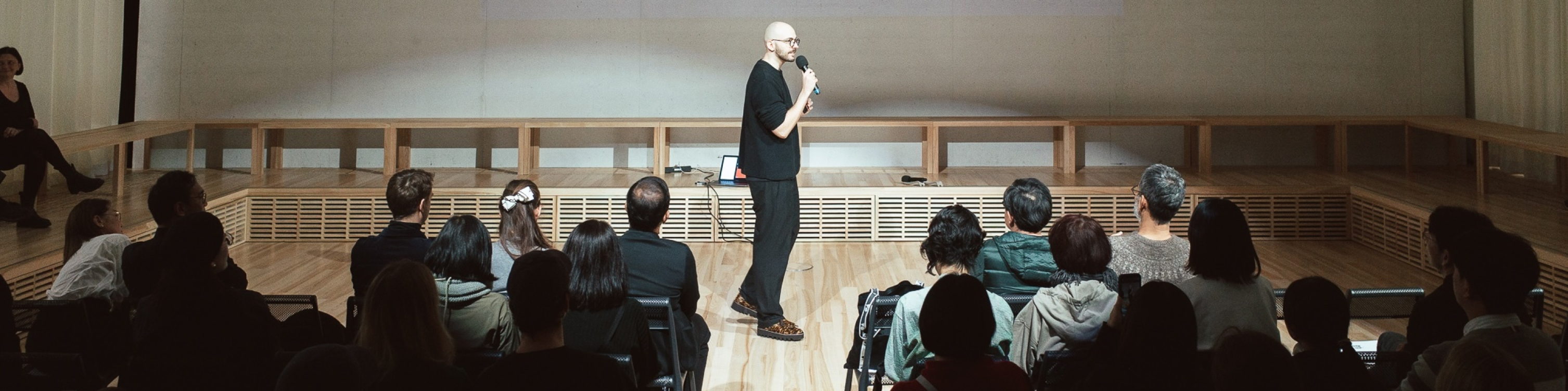
A product leaderProduct LeaderDefines product vision, aligns teams and stakeholders, and turns business goals into products that create measurable user and business value. / product builderProduct BuilderTurns ideas into real, usable products by combining strategy, UX, technology, experimentation, and execution from concept to launch. using AI-native thinking to turn complex customer problems into clear, scalable digital products.
00:00:00
Warsaw
The Moss
Client
The Moss
Scope
Strategy, UX, architecture, delivery, QA, launch
Year
Concept to launch readiness, 2026
Role
Head of Product
Live site
themoss.com
In short
The Moss is a Los Angeles SaaS platform for discovering, booking and managing beauty professionals for on-demand services. I joined when the business idea existed and the product did not: no user journeys, no requirements, no information architecture, no roadmap, no technical specification. My job was to turn a high-level vision into a coherent, scalable product that could be designed, engineered, tested and taken to market.
The starting line
The first challenge was not design. It was reducing ambiguity. Flip between what existed on day one and what existed when the product was declared launch-ready.
The constraints
The CEO's background in photography shaped everything: the interface had to feel editorial, premium, minimal and highly visual. The design principles were deliberately restrictive. Rather than treating them as limitations, I turned them into product principles that could guide every downstream design and engineering decision. Switch a conventional booking card into one that follows them.
- Black-and-white UI, no conventional accent colour
- Photography and video carry the visual richness
- Generous whitespace, highly focused layouts
- Minimal interface copy
- Sharp, precise geometry
- Mobile-first
- Hierarchy over decoration
From idea to requirements
The initial concept was intentionally broad, so the first job was making it actionable for design and engineering. I consolidated the business requirements, stakeholder assumptions, existing prototypes and operational constraints, mapped the primary journeys and translated them into functional requirements. That meant answering nine questions before a single screen was drawn.
Personas and user flows came out of this, stakeholder reviews served as validation checkpoints, and only once the core journeys were aligned did wireframing and interaction design begin. The point was a shared source of truth between business, design and engineering before development started.
Managing risk
One of the biggest product risks was also the hardest constraint. I advocated for direct user research and usability testing with the target audience. The stakeholders decided formal research would not happen at this stage: their industry experience, in their view, was enough. I flagged it explicitly as a product risk.
Rather than let the limitation become invisible, I treated it as an assumption-risk problem: document the decisions, validate flows with the stakeholders we did have, and keep the architecture flexible enough to absorb what the market would teach us. Four areas carried the most weight.
The structure matches how clients and professionals actually think about services.
Walked through with every available stakeholder, and built so sections can be re-cut without rebuilding the product.
The booking steps reflect real behaviour, not an idealised version of it.
Decisions documented, flows reviewed in cycles, and instrumented so post-launch data can show where people stall.
Minimal copy is enough for people who have never used the platform.
Copy treated as a replaceable layer, kept out of code wherever possible, so it can change without an engineering ticket.
The stakeholders' read of what clients will pay and what professionals will accept.
Named as the area most dependent on market evidence, and modelled so it can change after launch without structural rework.
Try it yourself
Most users would meet the platform on a phone, so mobile was the product strategy, not a responsive afterthought. The wireframes were built to reduce cognitive load, keep one clear task per screen, minimise steps, put the primary action where a thumb can reach it, and keep the brand's character inside a small viewport. Book a mock appointment and watch those rules hold.
- One decision per screen. Nothing competes with the choice you are making.
- The primary action lives at the bottom, inside the thumb zone, on every screen.
- Date and time come before artist selection. Each step keeps the next decision clear.
- Go back to adjust your choices, then confirm your mock booking with one clear action.
- The confirmation brings every booking detail together.
Product and engineering
Once the flows and prototypes had matured, a full-stack developer joined and together we mapped the technical infrastructure, integrations, data flows and operational dependencies. The goal: never design something theoretically elegant but technically expensive or hard to scale. So we evaluated the platform from both directions at once.
That loop let technical considerations shape the roadmap before they turned into costly engineering problems. Engineering then built against the agreed flows and prototypes, integrating the third-party services and automations the experience depended on.
Scoping the MVP
A key part of the job was keeping a clear line between what the product could eventually become and what it needed to be at launch. Every backlog item was held up against seven lenses. Pick one to see the question it asks.
That discipline kept the product from becoming an accumulation of features and kept the team on the core marketplace and booking experience. The MVP became the foundation to launch, collect market feedback and expand progressively, instead of solving every possible use case before meeting a single customer.
QA and launch readiness
Once the core functionality was implemented, the project moved into structured QA. I coordinated testing across the primary journeys, logged every gap between intended behaviour and implementation, prioritised it and routed it back to engineering. The question was never only whether a feature worked, but whether the whole experience worked as one coherent system.
After the final bug-fixing cycle, the platform reached a launch-ready state.
Governance
Product delivery did not end with the interface. I also coordinated the documentation required to operate the platform, prepared with and reviewed by legal counsel, with their feedback folded back into the product and its operational requirements.
- Terms of Service
- Privacy Policy
- Supporting operational documentation
This mattered more than usual. The platform involves multiple parties, transactions, user data, third-party services and automated communication. Legal and operational requirements had to be part of product development, not a post-launch exercise.
Outcome
The project went from a largely conceptual product to a launch-ready SaaS platform, with the pieces a product needs to exist rather than just to demo.
More importantly, it established a repeatable product foundation. The platform was built so the team could launch the core experience, watch how the market responds, see which assumptions held and which didn't, and turn that into the next iterations. At launch readiness a pipeline of further features was already identified and prioritised.
I owned the product lifecycle from concept definition through launch readiness, acting as the connective layer between business strategy, user experience, design, engineering, legal and operational requirements.
Responsibilities
© 2026, Alan Abramek. All Rights Reserved.