A product leaderProduct LeaderDefines product vision, aligns teams and stakeholders, and turns business goals into products that create measurable user and business value. / product builderProduct BuilderTurns ideas into real, usable products by combining strategy, UX, technology, experimentation, and execution from concept to launch. using AI-native thinking to turn complex customer problems into clear, scalable digital products.
00:00:00
Warsaw
UMLub
Client
Medical University of Lublin
Scope
Research, IA, prototype, RFP, rollout
Year
2023
Role
Lead UXer & Product Manager

In short
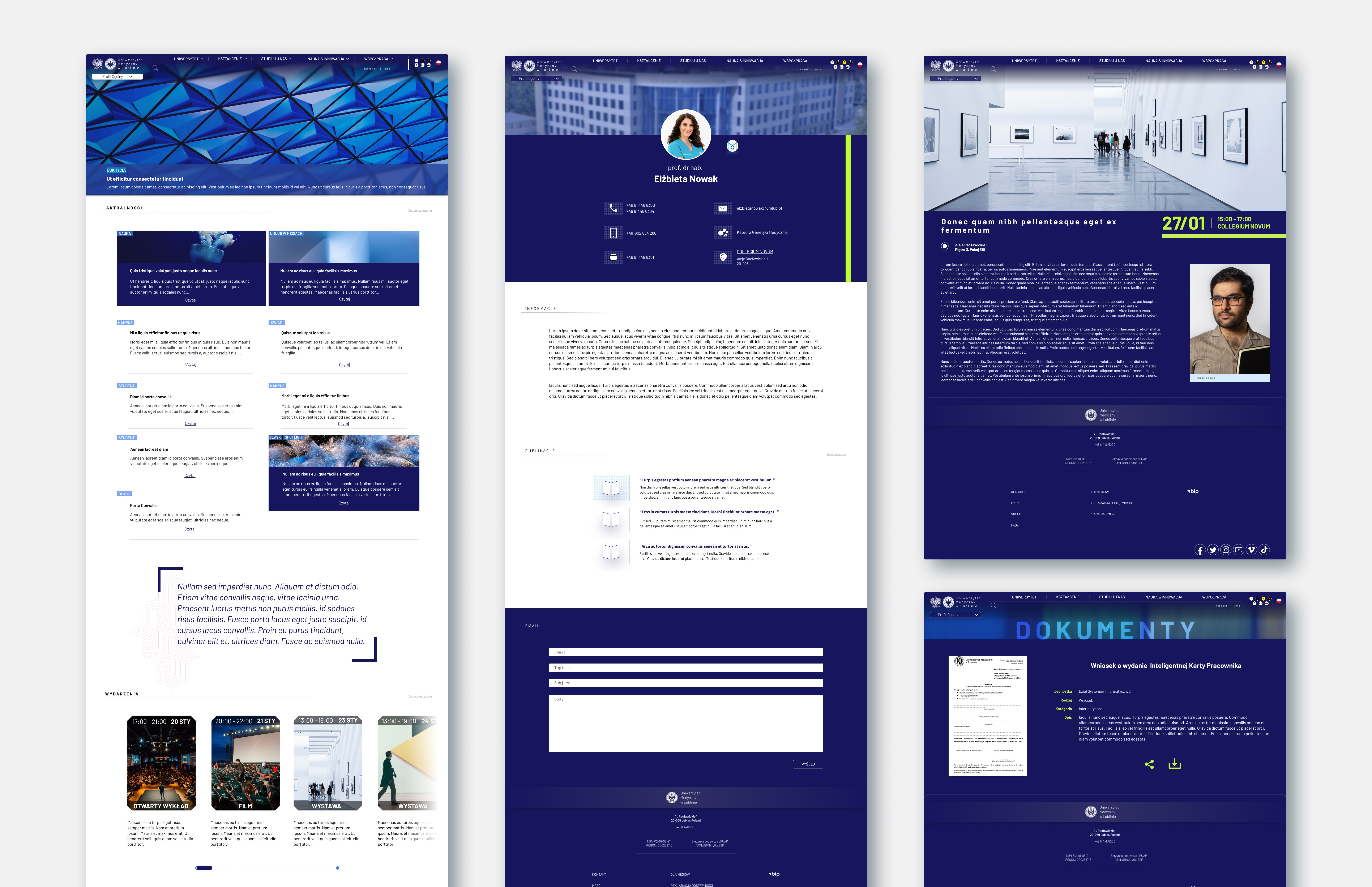
A university website from 2012 that its own students avoided. I led the redesign end to end: research, information architecture, prototyping, accessibility, a 70-page RFP.
Two roles, one project. Pick a hat to see what it covered.
- UX research: interviews, survey analysis, site analytics, accessibility audit
- Paper and digital wireframes, lo-fi and hi-fi prototypes
- Information architecture and tree testing
- Usability studies, iteration and responsive design
- Accessibility to WCAG 2.1
- Graphic design
- Co-wrote the 70-page RFP with the University's lawyers
- Selected and coordinated the software development partner
- Checked every proposed technology against University systems
- Helped install the product on University servers and connect it to the databases
- Stakeholder management across departments
- Owned the partnership between vendor and University through to launch
By the numbers
The problem
By the time I joined, the site was a decade old, busy, and organised like the University's org chart. Traffic was high, mostly on phones, and mostly frustrated. International students couldn't find campus life, requirements or locations; the Polish and English versions disagreed; and staff had quietly moved their news to Facebook.
Who we designed for
The research sorted everyone who touched the site into seven audiences with very different questions and one shared front door. Pick one.
The process
Six phases, from a folder of old survey results to a site running on the University's own servers. Step through them.
I split the competitors into two groups, direct and indirect, then analyzed each on first impressions, interaction and functionality, visual design, and content.
Key take-aways- Competitors organise information in a more streamlined, user-friendly way.
- Competitors have more responsive websites.
- Competitors hold a higher standard of visual appeal in their web design.
- Lacking search engine
- Cluttered design, especially on mobile devices
- Navigation based on the structure of the University

Prioritization followed the most requested features from students, employees, alumni, candidates and business partners, weighed against the pain points the research had surfaced.
- Responsive design
- Intuitive navigation
- Improving the search engine
- Clean, uncluttered design
- Accessibility

- Most users do not know the University's internal structure, so they cannot navigate a site organised around departments.
- Different user groups look for different information, and sometimes the same information by different routes.
IA tree test, findability. The goal was simple: is the proposed architecture more intuitive than the current one?


The prototype was responsive from the start, moving cleanly between mobile and desktop, and tested for readability at magnification up to 200%. The site was built to meet WCAG 2.1, with extra controls that let users enlarge the text and change the contrast.
Writing the Request for Proposal for the website and its CMS took extensive collaboration and research and ran to 70 pages, covering functional requirements and desired features including search, information architecture and responsive design. The hard part was balance: specifying our requirements precisely while leaving vendors room to propose their own implementation approach.
Accessible by design
WCAG 2.1 was the floor, not the ceiling. The prototype stayed readable at 200% zoom and handed people their own controls for text size and contrast. Try them on this sample.
The team
A redesign like this is mostly people. These are the ones who made it possible.
- Alan AbramekLead UXer and Product ManagerResearch, IA, prototype, RFP, vendor and rollout.
- Michał SzymanekWebsite administrator, project partnerTen years running the old site: knew every request, pain point and CMS quirk.
- Wacław UrbańskiDepartment managerOversaw the project and guided how University systems fit the new design.
- Monika LisHead of the University's legal teamKept every document, including the RFP, on the right side of the rules.
- Aleksander ByczyńskiRFP and procurementShaped the vendor selection and prepared the legal paperwork with Monika.
- Janusz Kokot, Jarosław KołodziejczykInfrastructureInstalling the site on the University's servers.
Takeaways
Three things I still carry from this project. Open them.
As a team lead, the behaviour and attitude you show is the behaviour and attitude you get back. It is the cheapest and most reliable motivation there is.
Some users and stakeholders vent at whoever is in front of them, and it is rarely the right target. Stay professional, stay empathetic, and listen: often the person simply wants to be heard, and there is a real problem underneath the tone.
People propose what they have seen work elsewhere. Take the need seriously and the proposed solution lightly. This project has its own users and its own goals.
Toolkit
© 2026, Alan Abramek. All Rights Reserved.